Checking the site for the convenience of clicking on the buttons with your finger
Result (example)
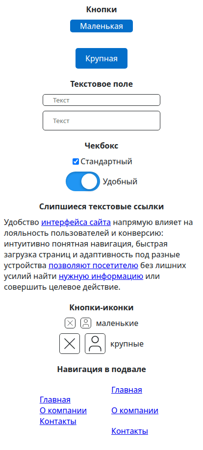
What is finger friendly?
The site page contains many active elements: links, buttons, form fields, overlapping lists, etc. To make it convenient for phone users to interact with them, it is necessary that these elements are large enough. Then it will be convenient to poke them with your finger on the screen.
If the size is too small, the user will miss the buttons. Moreover, he will need to be distracted to aim. That is, the user’s brain will be additionally loaded with the task of correctly pointing the finger at a narrow target on the screen. The level of user focus on the study of the site is reduced. This has a negative impact on sales.
Which elements should be finger friendly?
All the elements that are pressed with your finger.
You also need to fix all the elements that have a pointer cursor indicating a click. These elements are not buttons in the classical sense of the word. But they should still be easy to click.
How important is it?
By making the active interface elements convenient to press with your finger on the phone, you will get:
- Increase in user speed. The faster he interacts with the site, the more pages he will have time to visit.
- Increase the user’s focus on the site content. The user is not distracted by aiming and hitting the buttons. He completely immerses himself in the process of studying the site.
- The user will stop missing and getting annoyed, which will increase the conversion.
- Visually, everyone is used to the big buttons. Small buttons are perceived as a mistake or flaw on the site. This negatively affects his image.
How to fix it?
Just make the size of the active elements at least 40 by 40 pixels. That is, everything that can be clicked on, you need to make a minimum of this size.
What does “Not all elements are displayed” mean?
This tool is designed for visual highlighting of problem blocks. There are also hidden elements, for example, in pop-up windows. To find out about them, use the [page-checker] tool (/page-checker).